The market for Data Science has been growing extensively over the recent years. As a result, the position of “data scientist” has established itself as an attractive option for a career path and the competition for job opportunities is steadily increasing.To help you stay at the forefront, 365 Data Science team have conducted a study examining the state of job opportunities in data science. The data for this research come from 1,170 job offers, published across all major US states. From these, 365 Data Science has extracted information about the company offering the position, the required educational credentials and sought-after work experience, as well as the desired skills and techniques a successful data science candidate is expected to have. 365 Data Science notes that all data were extracted automatically and thus, some items may have been incorrectly labelled, assigned or overlooked. The following report analyses all intriguing findings in depth. Let’s get started. If you are ready to take the first step towards your data science career, you can experience a structured training program, learn new skills, and practice for the complete set of data science responsibilities here: https://bit.ly/365-data-science-courses The post Data Science Jobs Report 2020 by 365 Data Science appeared first on Data Science PR. via Data Visualization – Data Science PR https://ift.tt/2VrGeB0
0 Comments
With this data map, circles are displayed over a designated geographical region with the area of the circle proportional to its value in the dataset.Bubble Maps are good for comparing proportions over geographic regions without the issues caused by regional area size, as seen on Choropleth Maps. However, a major flaw with Bubble Maps is that overly large bubbles can overlap other bubbles and regions on the map, so this needs to be accounted for. The post Data Visualization Explained: Bubble Map appeared first on Data Science PR. via Data Visualization – Data Science PR https://ift.tt/2NyJKFv What if I told you that you could learn over 24 different tech skills, worth thousands of dollars in real-world value, for a fraction of the cost? Specifically 94% off what they originally cost?Well, that’s EXACTLY what’s happening inside the 2020 version of the Ultimate Tech Career Toolbox. After many long days and nights of negotiating and planning, we’ve been able to get 27 expert technical course creators to say “yes,” and help make that vision of mine a reality. I’m so excited to share what we’ve put together. In this post, you’ll find a detailed breakdown of every single product you’ll get in this year’s toolbox. If you went out and purchased all these products on your own, it would cost $4,206! Here’s the catch…this deal is so good that it’s only going to be available for five days: Monday, June 22nd to Friday, June 26th. Keep reading to see everything you’ll get inside! Sign up now: https://bit.ly/toolbox2020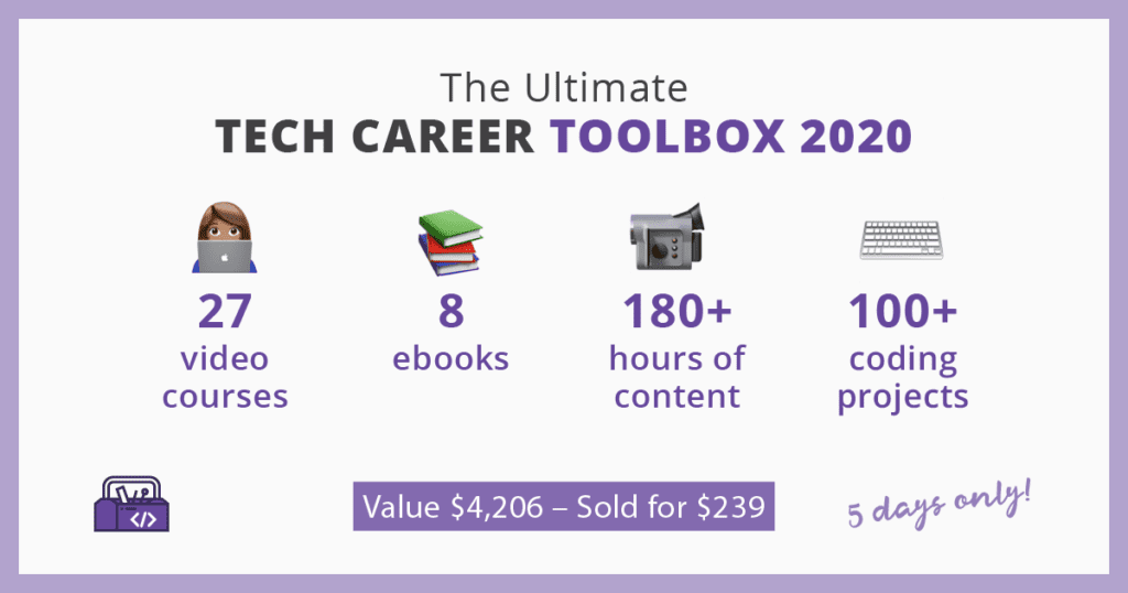
All The Products Inside the 2020 Ultimate Tech Career Toolbox
The post 33 Different Products to Level Up Your Tech Skills in 2020 appeared first on Data Science PR. via Data Visualization – Data Science PR https://ift.tt/2VdFPCd A Bubble Chart is a multi-variable graph that is a cross between a Scatterplot and a Proportional Area Chart.Like a Scatterplot, Bubble Charts use a Cartesian coordinate system to plot points along a grid where the X and Y axis are separate variables. However. unlike a Scatterplot, each point is assigned a label or category (either displayed alongside or on a legend). Each plotted point then represents a third variable by the area of its circle. Colours can also be used to distinguish between categories or used to represent an additional data variable. Time can be shown either by having it as a variable on one of the axis or by animating the data variables changing over time. Bubble Charts are typically used to compare and show the relationships between categorised circles, by the use of positioning and proportions. The overall picture of Bubble Charts can be used to analyse for patterns/correlations. Too many bubbles can make the chart hard to read, so Bubble Charts have a limited data size capacity. This can be somewhat remedied by interactivity: clicking or hovering over bubbles to display hidden information, having an option to reorganise or filter out grouped categories. Like with Proportional Area Charts, the sizes of the circles need to be drawn based on the circle’s area, not its radius or diameter. Not only will the size of the circles change exponentially, but this will lead to misinterpretations by the human visual system. 
The post Data Visualization Explained: Bubble Chart appeared first on Data Science PR. via Data Visualization – Data Science PR https://ift.tt/31eUaBY Brainstorm is also known as a Mind-map.A Brainstorm is a diagram used to map associated ideas, words, images and concepts together. Brainstorms are also a tool and method for idea generation, finding associations, classifying ideas, organising information, visualising structure and a general aid to studying. Brainstorms are often used at the initial stage of a project and work as a form of note-taking. They can also be useful in collaboration work and team-building morale. The structure of a Brainstorm is as follows: major categories extend out from a central node. Lesser categories branch out of the major ones as subcategories, which can also develop their own related subcategories. Here’s a simple guide to creating a Brainstorm:1. Start in the center of a page and write the title of the project or topic by encapsulating it in a shape (typically a circle or cloud). 
The post Brainstorm in Data Visualization appeared first on Data Science PR. via Data Visualization – Data Science PR https://ift.tt/37O9eYF Data science is an inter-disciplinary field that uses scientific methods, processes, algorithms and systems to extract knowledge and insights from many structural and unstructured data. Data science is related to data mining, deep learning and big data. Data science experts are needed in virtually every job sector—not just in technology. In fact, the five biggest tech companies. Here is an essential list of tips to kick start your data science career:
The post How to Get a Data Science Internship in 2020? appeared first on Data Science PR. via Data Visualization – Data Science PR https://ift.tt/3emAD6I We talk about an alternative way of getting into data science by becoming a data architect!More specifically, we’ll look at who the data architect is, what they do, how they fare in terms of salaries, and what skills and academic background you need to become one. Who is the data architect exactly?If you’ve seen the 1999 cult movie The Matrix, you probably recognize the Architect as the creator of the utopian world for human minds to inhabit. Much like their blockbuster counterpart, data architects create the database from scratch. They design the way data will be retrieved, processed, and consumed. Data architects are technical experts who adapt dataflow management and data storage strategy to a wide range of businesses and solutions. They’re in charge of continually improving the way data is collected and stored. In addition, data architects control access to data. So, all you corporate spies out there – now you know who to look for. Data architects are also responsible for design patterns, data modeling, service-oriented integration, and business intelligence domains. They often partner with fellow data scientists and IT guys to reach the company’s data strategy goals. A data architect constantly seeks out innovations to provide improved data quality and reporting, eliminate redundancies, and provide better data collection sources, methods, and tools… The post How to Become a Data Architect in 2020? appeared first on Data Science PR. via Data Visualization – Data Science PR https://ift.tt/2YMCYBf How IBM does data science consulting? In 2020 IBM does data science consulting by following their vetted best-practice framework.We will focus on a fascinating topic – the step-by-step process IBM’s data science team applies when working on a consulting project. We believe this overview can be highly beneficial for both experienced professionals and data science beginners. We will explore a best-practice framework applied by one of the pioneer and leading companies in the field. This way, you’ll get an insider’s look at how a consulting project that involves data analysis and data science unfolds. In addition, we will examine the results achieved in IBM’s data science consulting projects with major clients from different industries. Why is that important? Well, each of these initiatives serves as an invaluable lesson to the rest of the companies in the respective industry. If, for example, Carrefour managed to leverage AI to improve its supply chain processes, the rest of the global hypermarket chains would basically be obliged to follow, if they want to keep up. Let’s get right in and outline the five stages of a data science consulting project.
The post How IBM Does Data Science Consulting in 2020? appeared first on Data Science PR. via Data Visualization – Data Science PR https://ift.tt/2YRtNPQ The world of data and data science can seem overwhelming! But don’t worry! We have got you covered! In this Introduction to Data Science article, we will show you exactly how to get started!We’ll begin by clarifying the similarities and differences between the terms: Business Analytics, Data Analytics, Data Science, Business Intelligence, and Machine Learning. Then, we’ll focus on helping you digest the definitions you need to know in an effective way. By the end, you will be more than capable of being able to relate and apply varies expressions and buzzwords to the areas of data science they belong to! We hope this video helps you broaden your perspective. We’re also positive it will make the jumble of disciplines a little clearer and will assist you in choosing the best career path to enter the data science field! The post Introduction to Data Science in 2020 appeared first on Data Science PR. via Data Visualization – Data Science PR https://ift.tt/2ANAfiL Data science consulting companies are a hot choice if you’re looking for a job in the field. They offer numerous development opportunities, access to the latest technologies, and provide data-based solutions for top-notch companies across the globe. Furthermore, on top of generous salaries, they seem to have tons of cool perks – from unlimited vacation days and free meals to hair salons and masseuses on site. This doesn’t make your choice any simpler, though. With so many industries and companies out there, it’s hard to keep track of who-offers-what-and-where. The post Top 10 Data Science Consultancies to Work For in 2020 appeared first on Data Science PR. via Data Visualization – Data Science PR https://ift.tt/2UXhjVE |


 RSS Feed
